
By Sam Desiere
In a recent blogpost an anonymous researcher on roape.net showed that poverty in Rwanda has increased from 2011 to 2014 by 5 percentage points. This contradicts the official poverty statistics and narrative, which claim that poverty decreased by 5.8 percentage points, namely from 44.9% in 2011 to 39.1% in 2014 (NISR, 2015). Importantly, the author published the Stata-files used to analyse the data of the EICV 3 and EICV 4 household surveys, enabling other researchers to verify his claims.
Recently, I also calculated trends in poverty using the same datasets. Although I used a slightly different (and, arguably, less sophisticated) methodology, the results confirm that poverty did not decrease. In addition, I show that the poverty trends are very sensitive to the inflation rate used. With an inflation of 16.7% (as reported by the National Institute of Statistics of Rwanda, NISR), poverty indeed decreased by at least 5 percentage points. With an inflation rate of 30% – which is in my view more in line with the ‘real’ inflation rate – my estimates show that poverty increased by 1.2 percentage points.
The fact that two researchers arrive – independently from each other – at the same conclusion, strengthens my belief that the EICV surveys show that poverty in Rwanda has increased. This has important implications for the current debate about (rural) policies in Rwanda, but I leave a discussion of these implications to researchers and policy makers more familiar with the reality on the ground and focus in this blogpost on the technical aspects of estimating poverty trends.
In this this post, I briefly describe my methodology and key findings and discuss (food) price inflation, which turns out to be a critical parameter. The Stata do-files required to replicate my findings can be found here.
Methodology
Rwanda’s poverty estimates are based on the Integrated Household Living Conditions Survey (EICV by their French acronym), which are conducted every three years. I used data from EICV 3, conducted in 2010/11 and EICV 4, conducted in 2013/14, which are made publicly available by the NISR. More specifically, I used the modules on food consumption purchased on the market and food consumption from own production. In both waves, the questionnaire of both modules is nearly identical. Food consumption is reported for more than 100 food items.
Unlike the anonymous researcher, I did not use the modules on non-food expenditure. I did so for two reasons. First, the NISR reports that most households spend over 60% of their budget on food. Hence, food expenditure is a good proxy of poverty. Second, non-food expenditure would require some additional data cleaning, which requires additional assumptions. Hence, I simply calculated food expenditure in both waves.
The meta-data of EICV 4 (available on NISR’s website) clearly stipulates that each sampled household in Kigali was visited 11 times over a period of 33 days. The modules on food consumption were administered during every visit. Rural households were visited 8 times over a period of 16 days. The meta-data of EICV 3, however, does not provide information on the number of times a household was visited. I simply assumed that the same methodology, for both rural and urban households, was followed in wave 3 as in wave 4. If this assumption is wrong – something I could not check – the results presented below will be erroneous.
In both waves, households reported how much they had spent on food purchased on the market by food item since the previous visit of the enumerator. I simply added up expenditure on all food items. Households also reported how much they had consumed from own production. Converting the consumption from own production in monetary values was more challenging. Households typically reported consumption from own production in kg. Some households also reported in the same module how much they would have paid on the market for this food item. I used this information to calculate the median, national price for each food item and used this price to convert consumption from own production in its monetary value. Since relatively few households reported prices, I did not attempt to calculate region specific prices nor did I correct for price seasonality. On this point my methodology differs from the anonymous researcher, who calculated a Laspeyres price index to account for spatial and temporal price variation.
To verify my assumptions, I checked whether my estimates of food expenditure are correlated with the household poverty status as reported by the NISR and included as a separate variable in the datasets. In both waves, food expenditure was lower for households classified by the NISR as extremely poor compared to household classified as poor, and the expenditure of this group was in turn lower than the expenditure of non-poor households. These results, available upon request, confirm that my assumptions are at least partially similar to the assumptions of the NISR.
Food expenditure can only be compared between the waves if the food inflation rate between 2010/11 and 2013/14 is known. I used two different inflation rates. First, I used an inflation rate of 16.7%, which is reported by the NISR (NISR, 2016, p. 43). Second, I estimated inflation based on food prices reported by the respondents, which I also used to convert food consumption from own production in monetary values. Inflation is then defined as a weighted average of the price increase of nine important crops. I used the same weights as those used by NISR to construct the 2013/14 adjusted food poverty line (NISR, 2015, table B4, p. 38). These estimates of inflation will be discussed in greater detail below.
Since I did not calculate total expenditure, but only food expenditure, I could not use the poverty lines proposed by the NISR. I therefore followed the ‘inverse’ methodology. First, I assumed that the NISR correctly estimated poverty in 2010/11 (44.9%) and used this information to determine the food expenditure threshold in 2010/11 prices that corresponds with this poverty rate. Second, I deflated food expenditure in 2013/14 using two different inflation rates, namely 16.7% and 30%. The first inflation rate corresponds with the inflation rate used by the NISR and thus allows me to replicate the findings of the NISR. The second inflation rate corresponds with my own estimate of inflation using the price data from EICV 3 and EICV 4. Third, I used the food expenditure threshold as an alternative to a poverty line to estimate the poverty rate in 2013/14. This approach is valid because I am not interested in ‘absolute’ poverty figures, but only in poverty trends.
In all analyses, I used the population weights to make the results nationally representative.
Results
Poverty trends
Using the EICV 3 and EICV 4 datasets, I calculated food expenditure per adult equivalent, respectively in 2010/11 prices and 2013/2014 prices. In order to estimate poverty trends, food expenditure in 2013/14 has to be deflated to express it 2010/11 prices. Poverty trends are very sensitive to the inflation rate used to deflate food expenditure. Results are presented for two inflation rates: (1) an inflation rate of 16.7% as reported by NISR and (2) an inflation rate of 30%, which is at the lower end of my inflation estimates based on ESOKO price data or EICV price data (see below for a discussion of inflation).
Figure 1 shows cumulative frequency distributions of food expenditure for these two situations, while table 1 summarizes poverty trends
With an inflation rate of 16.7% (left panel, figure 1), real food expenditure per adult equivalent increased for all households from 2010/11 to 2013/14 and, as a result, poverty decreased. Assuming a poverty rate of 44.9% in 2010/11 (which corresponds to a food poverty line of 100,232 RWF per adult equivalent), poverty decreased by 7.9 percentage points. This poverty reduction is even more pronounced than reported by official statistics, which states than poverty decreased by 5.8 percentage points.
With an inflation rate of 30% (right panel, figure 1), food expenditure does no longer increase between 2011 and 2014 for all households. Again assuming that poverty is 44.9% in 2010/11, poverty even increased by 1.2 percentage points.
Figure 1: Cumulative distribution of food expenditure per adult equivalent for EICV 3 and EICV 4 for an inflation rate of 16.7% and 30%

Table 1: Poverty trends in function of the inflation rate
| Inflation: 16.7% | Inflation: 30% | |
| Poor HH EICV 3 (official statistics) | 44.9% | 44.9% |
| Poor HH EICV 4 (own estimates) | 37.4% | 46.1% |
| Trends in poverty (percentage points) | -7.5 | +1.2 |
In sum, the poverty trends are very sensitive to the inflation rate. With an inflation of 16.7% from 2011-2014, poverty decreased by at least 5 percentage points, which is in line with the official reports. With an inflation rate of 30%, poverty does not decrease. The question thus boils down to an accurate estimation of the inflation rate between 2011 and 2014.
Inflation rate
The EICV survey is not an ideal dataset to estimate inflation, because it does not contain much information on food prices. As explained earlier, some households report prices for those food items consumed from own production. This does not only mean that the number of observations is relatively limited, but also that households report prices of those items they did not buy on the market. I nevertheless used this information to calculate mean and median average prices by food item. I calculated national averages without taking into account price seasonality or regional price differences. In order to estimate ‘average’ inflation, a weighted average is taken over nine crops. The weights are proportional to the weights used for the construction of the 2013/14 adjusted food poverty line (NISR, 2015, table B4, p. 38). These nine crops account for 86% of the total calorific intake of the food basket. Two crops dominate this index: cassava (fermented) (weight: 38%) and dry beans (weight: 25%).
Figure 2 shows the increase in mean and median prices between 2010/11 and 2013/14 for nine crops, while the horizontal lines indicate the weighted average. The increase in median prices ranges from 10% for sorghum to 50% for cassava (both flour and roots). Median and mean inflation are 33% and 42%, respectively. This corresponds to an annual inflation of 9.5% and 12.5%, respectively.
Figure 2: Price increase for nine crops from 2010/11 to 3013/14 (mean and median prices)

These inflation estimates are substantially higher than the ones reported by NISR, which states that food prices increased by 16.7% between Jan 2011 and Jan 2014 (NISR, 2016, p. 43). Moreover, the estimates based on the EICV surveys are remarkably similar to the estimates based on detailed ESOKO price data, where I estimated inflation at 30.5% over the 2011-2014 period (details not reported here).
In sum, I believe that the ‘real’ food inflation rate is substantially higher than the one used by NISR to estimate poverty trends. This probably explains why I find that poverty increased, while the NISR reported that poverty decreased. These findings raise concerns, not only for Rwanda’s (rural) policies, but also for international donors that have presented Rwanda as a model for development because of the supposedly strong poverty reductions.
Sam Desiere is currently a senior researcher at HIVA, the research institute for work and society of the University of Leuven, Belgium. In 2015 he obtained a PhD in agricultural economics from Ghent University, Belgium, which focused on data quality of household surveys in developing countries.
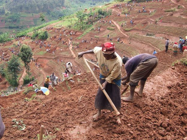
Featured Photograph: As part of the DFID funded Vision 2020 Umurenge Programme (VUP), Rwanda’s flagship Social Protection Programme, women and men in northern Rwanda work on a public works site in 2012, building terraces to prevent soil erosion.

.jpg)
Pingback: Faking it: The Rwandan GDP Growth Myth – Gahunde